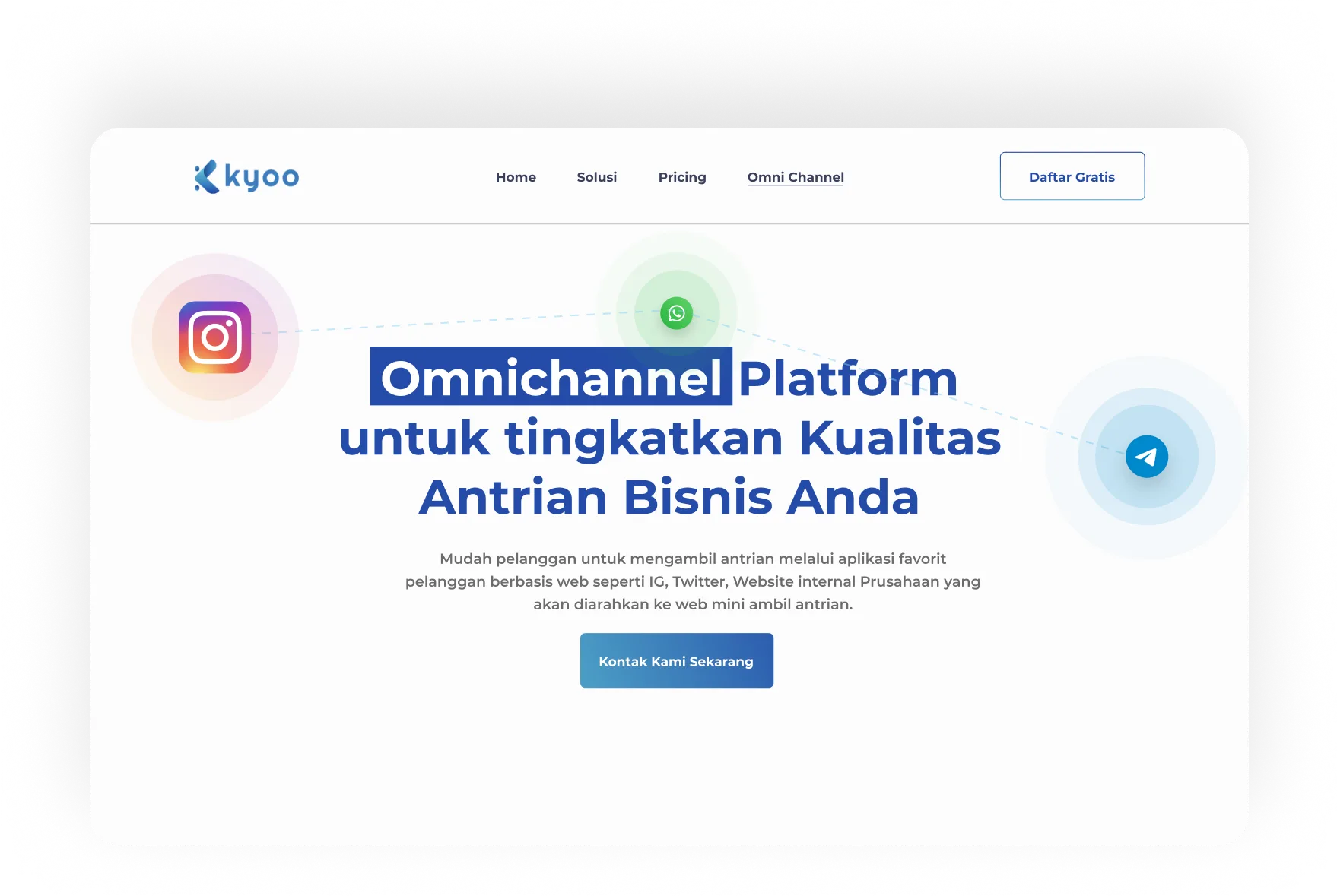
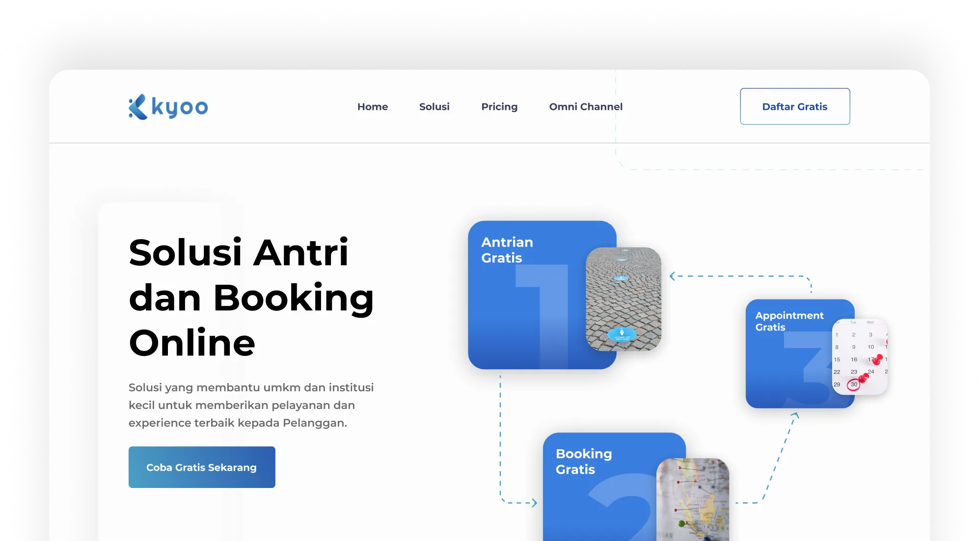


Kyoo is a multiplatform application available on both mobile and desktop dashboard. Basically, Kyoo handles the buesiness who need queue and appointment system such as Bank, Hospital, Coffe shop and many more. By digitising the system, users no need to go to the place where they want to book or have an appointment. Just by clicking on kyoo’s app, user can easily book and get notified by the system
Lead Product Designer • Ricky
Redesign UI
Product Strategy
System Design
Frontend Developer • Yohanes
The previous design was not eye-catchy like incosistency in colour, the layout was messy, no clear direction what user needs to do. So user got confused and by the survey and eventually user prefer to use another application

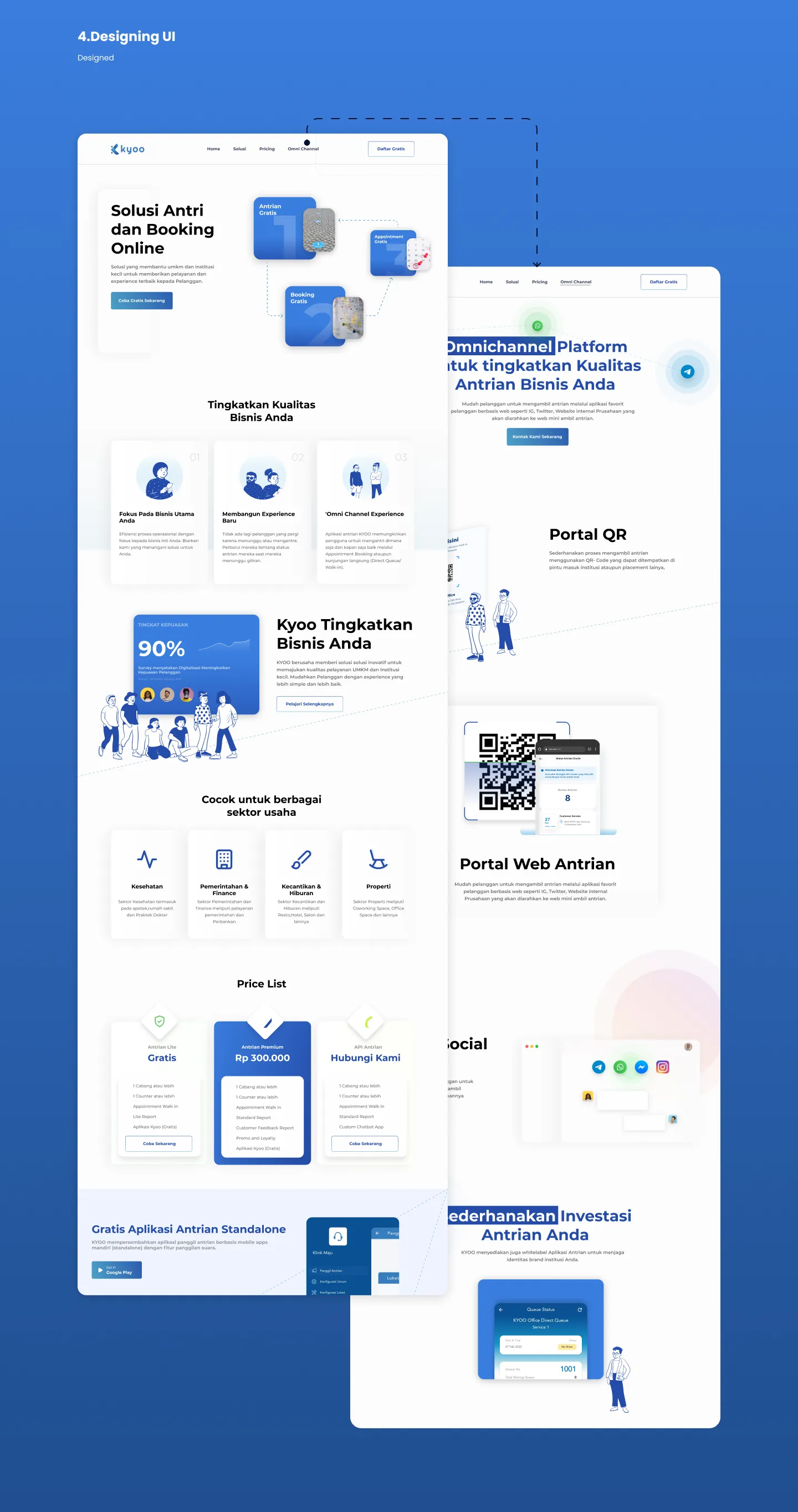
We defined what kind of user that would use the app, created desgin system for consistency and have a good UX Flow which user won’t get confused and mislead whenever they visit kyoo’s website. By those fixes, We could increase kyoo’s user and the business grow rapidly
⚙️
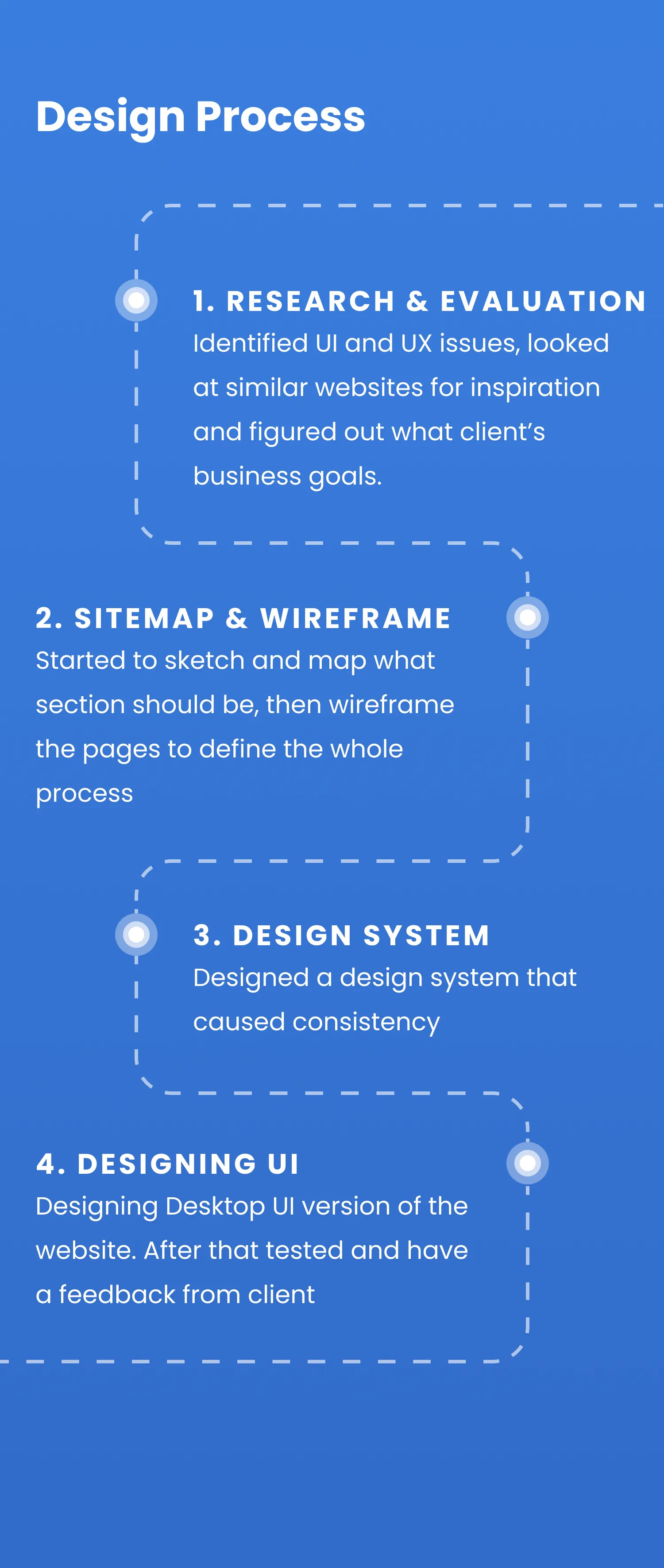
Our work in this project was as UI/UX Designer and as Front end developer which was worked by Samuel. The process involved researching, identifying pan paints, wireframing, gathering feedback, and designing the pages, followed by developing and producing the content. Bases on testing and client’s feedback, this process was iterated.


client actually has an old version before the website was redesigned. So we can’t show you how it looked like.
In old version website design, there are some concern client asked to be fixed, such as :
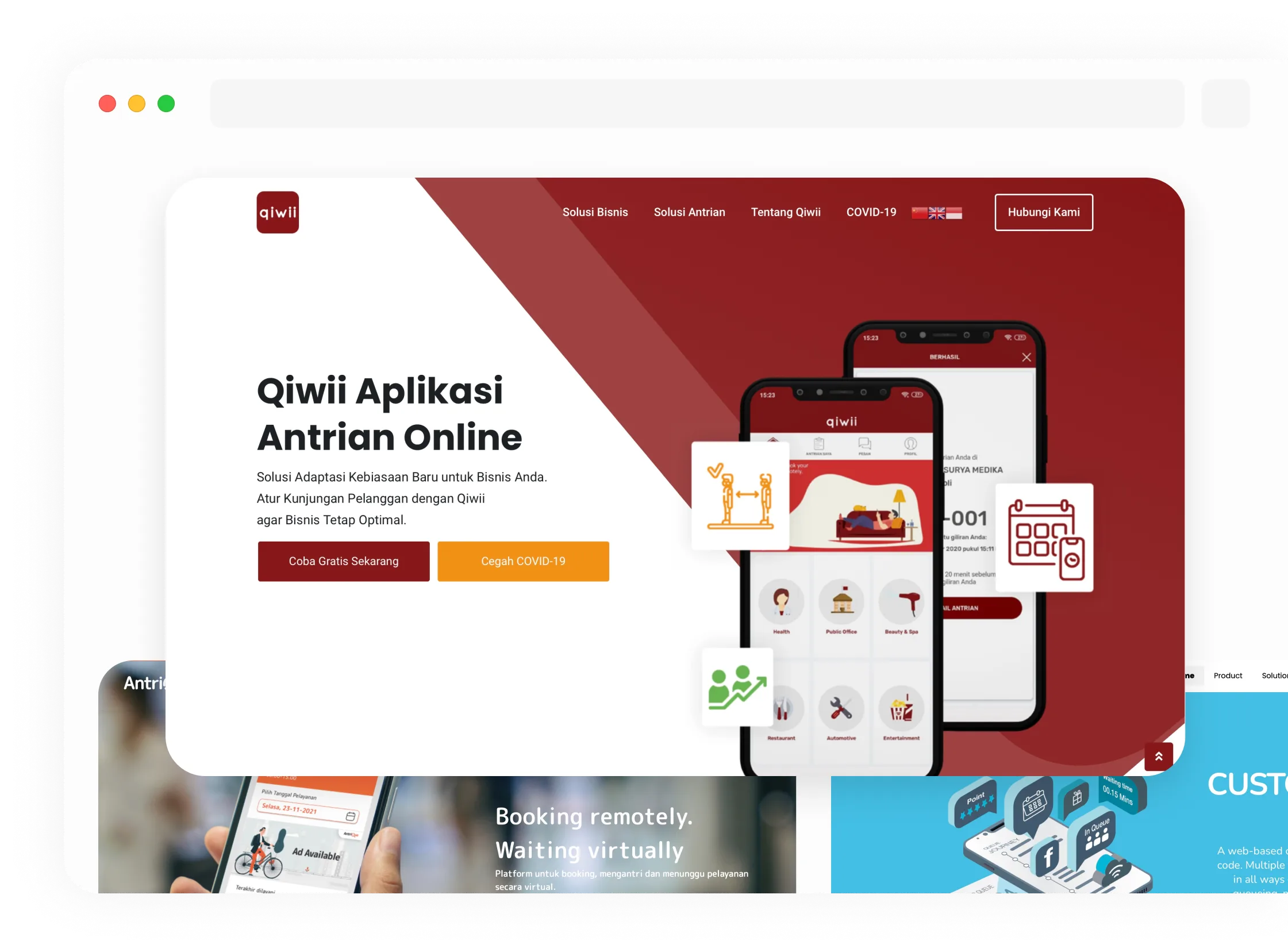
So, we reached out the client who’s the target user and what kind of user who would use and see the website and its app. We found some references that also refer to the target business like Antrique, Queuebee, and Qiwi
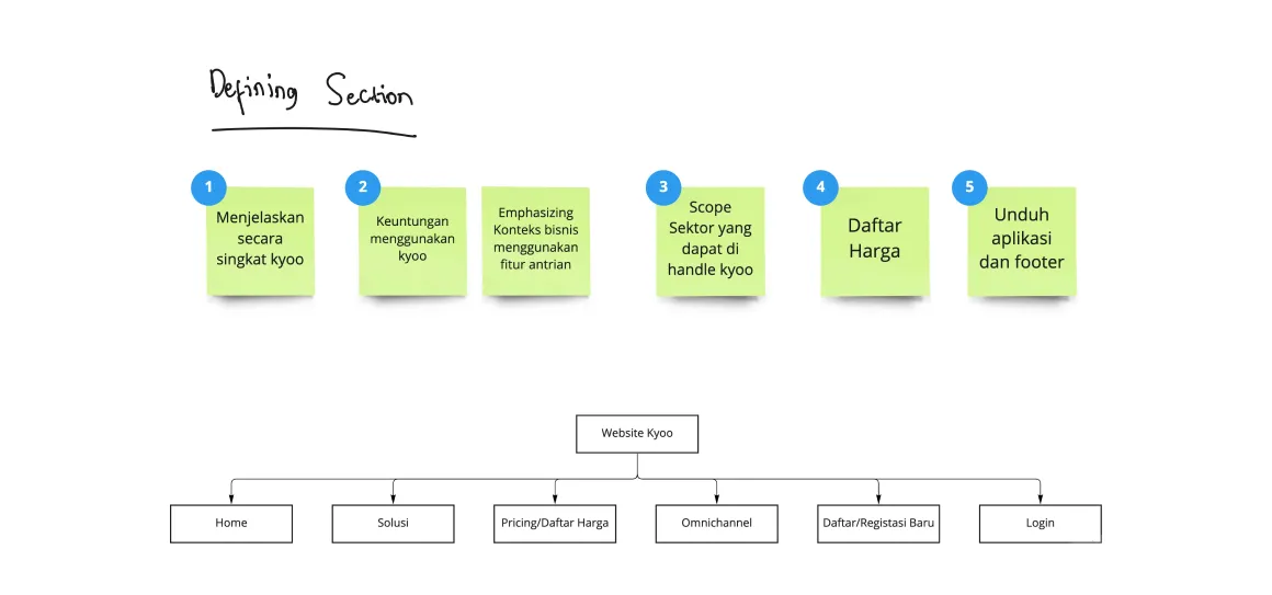
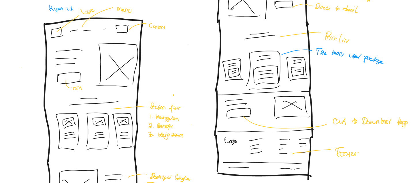
Creating user flow was unneccessary since the website has short flows, so sketched the sitemap and wireframed it. I drew them just in Miro because the project timeline was too short
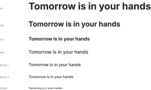
I defined the typography, buttons, icons and components of the design system.
I used only one font family which is sans serif, the titles of the website have a regular look. Body and paragraphs written in sans serif font since they are complementary and more readable
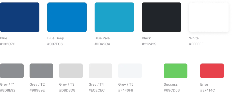
Kyoo company mainly used blue light colour for branding and didn’t organise the other colours. After consulting with client, I decided to use the same blue colour but with other accents that helps for defining the status or secondary colour since it is an excellent complement.
💡
After working closely with engineering to bring the designs to life, we launched and test at every section and the flow should be. At the project’s inception, we documented the whole project which can help company brand guideline. Fortunately, our users found the experience more engaging and satisfying than ever.
The owner didn’t want us to research to deep to this website and also the app due to company’s confidential
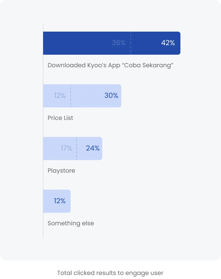
We did research in closed survey and interview. Asking several questions directly to user like “Are you satisfied with the design?” is the important one which can describe the entire web score and we know how they’re interested to visit the website.
Based on reseach data, we spread to 5 old users and 5 new users. As result, we found 8 from 10 feel better experience from some of aspects. Such us :
1. User satisfied with the information that is given by kyoo (not too much, just enough)
2. Feature are simpel and quite clear
3. User doesn’t feel confused like from which way to go to from one section to another
By listening to our users and making changes that provided real value to them, we created a dynamic website section. I grew as a designer and walked away with a few key takeaways :
There is always value in listening to user feedback. Even if you already know a problem exists, user feedback can help you narrow in on the nuances and can be used to help get the rest of your organization on board